

Occam Design System
Evolving a design system from reusable components to an AI-ready platform
Occam is Zuora’s design system, built to unify product experiences, improve consistency, and accelerate development across teams.
My Role : Lead Product Designer
Timeline : 4+ years
Team : Design Systems + Engineering

Key responsibilities:
-
Led the evolution of the Occam Design System
-
Designed and maintained components, patterns, and foundations
-
Built and organized the Figma library architecture
-
Managed documentation and the Occam website
-
Partnered with engineering to align Figma, Storybook, and MUI
-
Supported adoption through education and designer enablement
-
Expanded Occam for AI-assisted workflows and MCP compatibility
The Challange
As Zuora's products expanded, maintaining consistency became increasingly difficult.
Several challenges slowed both design and engineering:
-
Highly complex product domain
Zuora’s products involve complex workflows, data-heavy interfaces, and enterprise-level use cases, requiring components that go far beyond simple UI patterns.
-
Inconsistent UI across products
Without a unified system, teams created their own solutions, leading to fragmented user experiences and inconsistent interaction patterns.
-
Balancing MUI constraints with product needs
The system was built on top of MUI to accelerate React development. While this provided a strong technical foundation, many product requirements required extending and customizing components beyond standard MUI capabilities.
-
Lack of standardized patterns
There were no clearly defined interaction patterns, making it difficult to ensure consistency across features and products.
-
No centralized documentation
Component usage, behavior, and guidelines were not documented, making adoption difficult and increasing the risk of misuse.
-
No single source of truth
Design assets, components, and implementation references were fragmented across tools, leading to misalignment between design and engineering.
-
Limited design system resources
The design system was led by a small team of two designers, who were also contributing to product work, requiring scalable solutions and careful prioritization.
Rather than simply creating more components, we needed to build a scalable ecosystem that teams could confidently adopt and evolve.

- Evolution 1 -
Building the Design System
Creating the foundation
The first stage focused on establishing a reusable design language that could scale across products while remaining aligned with engineering.
We built the system around Material UI to accelerate React implementation while extending it with enterprise-specific capabilities required by Zuora's products.
Built:
-
60+ reusable components
-
25+ interaction patterns
-
15+ data visualization elements
-
Foundations including typography, color, spacing, icons, motion, accessibility, and design tokens

Component Library
Every component was designed to be:
-
Reusable
-
Accessible
-
Scalable
-
Compatible with Material UI
-
Optimized for enterprise workflows
-
Many components extend standard Material UI behavior to support complex product requirements while preserving implementation consistency.
Foundations
To ensure consistency across products, we established a shared visual language including:
-
Color tokens
-
Typography
-
Spacing
-
Elevation
-
Motion
-
Accessibility
These foundations became the building blocks for every new component and pattern.

- Evolution 2 -
Scaling Adoption
Building components was only part of the challenge.
The larger goal was helping teams adopt and confidently use the design system in their daily work.
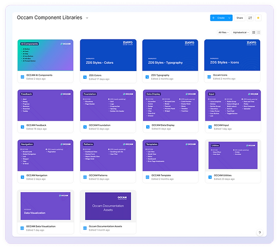
Figma Architecture
As the library grew, we reorganized the entire Figma ecosystem to improve discoverability and scalability.
The library was structured into clear categories:
-
Foundations
-
Components
-
Data Display
-
Navigation
-
Patterns
-
Templates
-
AI Components
This organization reduced search time and made it easier for designers to find the right building blocks.
Documentation & Website https://occam.zuora.com/
We created the Occam website as the central source of truth.
The documentation includes:
-
Component guidelines
-
Usage recommendations
-
Pattern documentation
-
Accessibility guidance
-
Examples
-
Engineering references
Instead of relying on tribal knowledge, designers and engineers could access consistent documentation in one place.


Supporting Adoption
Creating a design system doesn't guarantee people will use it.
We invested in adoption by:
-
Announcing new components and updates
-
Educating designers on best practices
-
Maintaining a dedicated Slack support channel
-
Partnering closely with engineering
-
Keeping Figma, Storybook, and documentation aligned
The design system became part of the team's everyday workflow rather than a static library.
- Evolution 3 -
Preparing for the Future
As AI became part of product design workflows, we saw an opportunity to evolve Occam beyond a traditional design system.
Instead of being built only for people, Occam could also become understandable by AI.
Building an AI-Ready Design System
We created the Occam AI Knowledge Pack – a structured repository that enables AI agents to understand and generate interfaces aligned with the design system.
The repository includes:
-
Design tokens
-
Component specifications
-
Foundations
-
Patterns
-
Templates
-
Implementation rules
-
Prompting guidance
-
Documentation
Rather than searching through scattered documentation, AI tools can retrieve structured information directly from the knowledge base.


Preparing for MCP
We're also evolving Occam to support Model Context Protocol (MCP), enabling AI tools to access design system knowledge through standardized interfaces.
This work prepares Occam for future AI-assisted design and development workflows while maintaining consistency across generated experiences.
Impact
System Growth
-
60+ reusable components
-
25+ patterns
-
15+ data visualization elements
-
Foundations, tokens, templates, and documentation
-
Centralized documentation website
-
AI-ready knowledge repository
Organizational Impact
-
Improved consistency across products
-
Reduced duplicated design effort
-
Faster onboarding for designers
-
Better alignment between design and engineering
-
Scalable foundation for future product growth
Reflection
Leading the evolution of Occam taught me that a successful design system is more than a collection of reusable components. It requires governance, education, documentation, cross-functional collaboration, and continuous iteration.
Today, Occam continues to evolve – from supporting designers and engineers to enabling AI-assisted workflows – demonstrating how design systems can become strategic platforms that scale with both organizations and emerging technologies.


