
Reimagining the Zuora Developer Experience
Helping developers navigate complexity, from finding the right information to identifying and investigating API problems.
Timeline : 4 Sprints
Scope : UX, IA, Dashboard Design, Prototyping
Team : PM, Engineers, DevX
My Role : UX / Product Designer

Project Overview
Zuora’s developer ecosystem includes APIs, documentation, implementation resources, operational data, and tools used by developers across different stages of their work.
As the ecosystem grew, developers faced two connected challenges:
-
Before building an integration, they needed to understand the ecosystem and quickly find the right technical resources.
-
Once integrations were running, they needed to understand API health, recognize problems, and investigate the requests behind them.
I worked on two connected initiatives—the redesign of Zuora’s Developer Center and the creation of an API Monitoring Dashboard—to improve these critical moments in the developer journey.
Across both projects, I focused on one fundamental question:
How might we help developers find the right level of information at the right moment without overwhelming them with complexity?
My Role
I worked as the product designer across both initiatives, collaborating with product managers, engineers, technical stakeholders, and other partners involved in the developer experience.
My responsibilities included understanding developer workflows, defining information hierarchy, exploring navigation and interaction models, designing workflows and interfaces, and working with cross-functional partners to refine the solutions.
My design focus differed between the two initiatives.
For the Developer Center, the primary challenge was information architecture: organizing a growing ecosystem of APIs and technical resources and helping developers understand where to begin and where to go next.
For the API Monitoring Dashboard, the primary challenge was information prioritization and progressive investigation: helping developers recognize meaningful problems quickly and progressively access deeper technical information.

Developers were navigating complexity at every stage of their journey
Developers interact with Zuora’s platform with different levels of knowledge and different goals.
Some arrive knowing exactly which API they need.
Others begin with a Zuora product, a business problem, or an implementation task.
Once integrations are running, developers face a different kind of complexity. They need to interpret API activity, understand whether systems are operating normally, and investigate failures when something goes wrong.
The interfaces were different, but the underlying design challenge was similar:
How do we make complex technical information understandable without hiding the depth developers need?

Understanding our developers
Different users interacted with the developer ecosystem with different goals.
An integration developer might need to discover an API, understand how it works, and quickly move from documentation to implementation.
A support engineer might need to identify failures, understand their scope, and investigate individual API requests.
A platform administrator might need broader visibility into API usage, trends, and operational issues.
Although their workflows differed, one pattern appeared across the experience:
Developers rarely needed all available information at once.
The Challenge
Internal research and stakeholder feedback revealed that developers perceived Zuora’s APIs and onboarding workflows as difficult to navigate compared to competing platforms. Documentation, monitoring tools, debugging workflows, and API resources were fragmented across multiple surfaces, making onboarding and troubleshooting unnecessarily complex.
As the developer ecosystem continued to grow, the team needed a more cohesive experience that improved discoverability, reduced friction, and helped developers move from onboarding to implementation faster.
Key Painpoints

Fragmented developer ecosystem
Developer resources were spread across multiple disconnected surfaces, making it difficult to navigate between documentation, APIs, SDKs, tutorials, logs, and troubleshooting tools.
No single source of truth
Developers often relied on multiple platforms and internal tools to complete a single workflow, creating inconsistency, duplicated effort, and confusion across the experience.
Poor API discoverability
Developer resources were spread across multiple disconnected surfaces, making it difficult to navigate between documentation, APIs, SDKs, tutorials, logs, and troubleshooting tools.
Weak search experience
Search results lacked relevance, context, and meaningful filtering, making it difficult for developers to quickly find the right endpoints, guides, or troubleshooting information.
Complex navigation
Critical tools like API monitoring and system health were buried deep within administrative navigation, making them difficult to access for developers and support teams.
Limited debugging context
Developers lacked visibility into request payloads, tracing, and error context, making troubleshooting workflows inefficient and heavily dependent on engineering support.
Inconsistent documentation architecture
API documentation structure, terminology, and hierarchy lacked consistency, making it harder for developers to build mental models of the platform.
Data-heavy workflows with poor usability
The existing monitoring experience prioritized raw system output over actionable insights, making it difficult to quickly identify failures, patterns, or performance issues.
The emotional result was predictably bad: uncertainty, friction, and low confidence.
Research and Discovery
Competitive analysis
The competitive review helped clarify the standard Zuora needed to meet.
-
Stripe led with exceptional clarity, task-based navigation, and a developer experience that builds confidence quickly.
-
Twilio showed how to support multiple developer journeys without adding unnecessary complexity.
-
Atlassian offered a strong model for organizing complex systems in a way that still feels intuitive and easy to navigate.
-
Datadog stood out for its ability to present dense operational data with strong structure, filtering, and drill-down.


Metrics and Evidence
The case for change came through clearly in a mix of survey feedback, stakeholder input, and support-team pain points.
In an early survey of roughly 25 developers, responses were split in a way that pointed to real usability issues: 27% described Zuora APIs as “difficult,” while only 45% described them as “easy.” A smaller follow-up survey gave the API documentation a 3.1 / 5 rating, which suggested the experience was functional, but still not as intuitive or efficient as it needed to be.
That feedback lined up with what we were hearing internally. Prospects were comparing Zuora against more polished developer experiences like Stripe, and support teams were still having to ask for request IDs, payloads, and trace details because the product did not surface that context clearly enough.
Taken together, the research pointed to one clear opportunity: reduce friction, improve discoverability, and make debugging feel built into the product rather than something developers had to work around
Designing the right level of information at the right moment
The challenge wasn’t reducing complexity—it was revealing it at the right pace.
Developers rarely need every piece of information at once. Instead, their questions become more specific as they progress through a task.
By designing for these moments—orientation, context, awareness, and depth—I created experiences that support quick decisions while making richer technical information available when it’s needed.

- Part 1 -
Rethinking how developers discover information
As Zuora’s API ecosystem expanded, the challenge shifted from simply providing documentation to helping developers discover the right information efficiently.
The existing homepage successfully surfaced tutorials but offered limited support for developers who arrived with different goals.
-
Some wanted to browse products
-
Others already knew the API they needed
-
Some were looking for SDKs
-
Others simply wanted to search
Instead of redesigning the interface around visual changes, we focused on restructuring the experience around developers’ information-seeking behaviors.
Existing experience
(Opportunities for improvement)
The existing Developer Center exposed valuable resources, but the information architecture made it difficult to understand how everything connected. Developers needed more than access—they needed guidance.

Design Goals
Dev Center Homepage

Information Architecture
Designing around how developers search for information
Our research showed that developers rarely follow the same path.
-
Some think in terms of products
-
Some think in terms of use cases
-
Some search directly for APIs
-
Others look for SDKs or documentation
Instead of forcing a single navigation model, we designed multiple entry points that support these different mental models while maintaining a consistent information hierarchy.

Design Principles
The redesign focused on creating an experience that adapts to how developers search for information rather than forcing a single navigation path.
Five principles guided the redesign:
-
Multiple entry points
-
Better information hierarchy
-
Support for different mental models
-
Stronger discoverability
-
Progressive navigation

Search
Rather than limiting search to documentation, we designed a unified search experience that surfaces APIs, methods, and documentation together.
This allows developers to move directly from a search query to the exact technical resource they need, reducing the amount of browsing required to find relevant information.
Supporting Different Developer Mental Models
Not every developer approaches documentation the same way.
Some begin with a product they are integrating, while others think in terms of a task they need to accomplish or an API they already know. Designing around a single navigation model would force many developers to translate their mental model into the system’s structure before finding the information they needed.
To reduce this friction, we designed multiple entry points that support different ways of exploring the platform while maintaining a consistent information architecture underneath.

Making Information Easier to Discover
The previous experience emphasized tutorials as the primary entry point. As the platform grew, developers also needed faster ways to discover APIs, SDKs, documentation, and supporting resources.
Instead of presenting everything together, the new homepage organizes information into logical layers that reflect how developers typically search.
The homepage now helps developers move naturally from exploration to implementation.

- Part 2 -
Designing an API Monitoring Experience That Drives Action
Finding the right documentation was only one part of the developer experience.
Once integrations were running, developers faced a different challenge: understanding what was happening inside their APIs.
Instead of searching for documentation, they were now asking questions like:
-
Is everything working as expected?
-
Which APIs are failing?
-
Where should I investigate?
-
What happened inside this request?
The challenge shifted from discovering information to making sense of operational data.
The Challenge
Turning Data Into Actionable Insight
API monitoring tools often present large amounts of operational data, but developers rarely need to analyze everything at once.
During conversations with stakeholders and engineers, we identified a common workflow:
-
Developers don’t start by investigating individual requests.
-
They first need confidence that something is happening.
-
Only then do they narrow the problem and inspect technical details.
This became the foundation for the dashboard experience.

Design Principle
Progressive Investigation
Just like the Developer Center progressively revealed technical information, the monitoring experience progressively revealed operational information.
Instead of presenting every metric and log entry simultaneously, the dashboard guides developers through a structured investigation flow.
Each level answers a different question before introducing additional complexity.

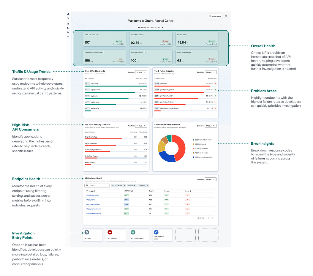
Dashboard Overview
Helping Developers Recognize Problems at a Glance
The dashboard begins with an overview of API health.
Rather than requiring developers to interpret dozens of metrics, the experience highlights the signals most likely to require attention. This allows developers to quickly answer the first question: “Do I need to investigate?”
Information is intentionally prioritized so that meaningful changes stand out without overwhelming the user.
Drilling Into the Details
Once developers identify an area of concern, they need to inspect the requests behind the pattern.
At this stage, the information hierarchy changes. High-level metrics become less important while request-level information becomes the primary focus.
The experience allows developers to move from aggregated insights to individual requests without losing the context of their investigation.

Designing for Progressive Investigation
Both the dashboard overview and the detailed request view were designed around the same principle: reveal only the information developers need at each stage of their investigation.
Rather than overwhelming users with logs and technical data from the start, the experience guides them through a structured workflow—from identifying a problem to understanding its root cause.
Each layer answers a different question:
-
Is something wrong?
-
Where is the problem?
-
Which request caused it?
-
What happened?
This progressive approach helps developers make decisions faster while keeping detailed technical information readily available when they need it.
One Workflow, Not Separate Screens
Instead of treating the dashboard as a collection of pages, we designed it as one continuous investigation flow.

Outcome
The final solution helps developers:
-
Detect issues at a glance through prioritized health metrics.
-
Quickly identify where failures are occurring.
-
Narrow investigations using filters and trends.
-
Access request-level details without losing context.
-
Resolve issues more efficiently with relevant technical information.
Reflection
Working on both the Developer Center and API Monitoring Dashboard reinforced the same design principle: complex systems don’t become easier by showing less information—they become easier by showing the right information at the right time.
The Developer Center focuses on helping developers discover information, while the API Monitoring Dashboard helps them interpret and investigate it. Across both experiences, progressive disclosure and clear information hierarchy were the foundation for reducing cognitive load and improving developer workflows.
Different developers needed different paths through the platform.
The existing developer ecosystem served a wide range of users — from first-time API consumers to support engineers troubleshooting production issues. Each role entered the platform with different goals, workflows, and technical contexts, but the experience lacked a unified structure that adapted to those needs.
To create a more scalable developer experience, I mapped the ecosystem around user intent, onboarding maturity, and troubleshooting workflows.


